The Photographic Community for Users of Olympus and OM system micro 4/3 digital cameras and E-series DSLRs
| Home | Login |
Search
Forum
Actions
New Document
New Folder
List Folders
List Documents
List Groups
List Users
Camera resources
Olympus 4000
Olympus 4040
Olympus 5050
Olympus 5060
Olympus 7070
Olympus 8080
Olympus E-M1 II
Olympus E-M5
Olympus E-P1
Olympus E-P2
Olympus E-PL1
Olympus E-PL3
Olympus E1
Olympus E3
Olympus E30
Olympus E300
Olympus E330
Olympus E400
Olympus E410
Olympus E420
Olympus E500
Olympus E510
Olympus E520
Olympus E620
m4/3 lenses
Camera FAQs
Terms of Service
Photo contest
Submissions page
Hall of fame
Folders
About this site
Documents
Polls
Private folders
Public folders
Categories
Abstract
Action/Motion
Animal
Architecture
Candid/Snapshot
Cities/Urban
Documentation
Fashion/Glamour
Historical
Landscape
Macro
Miscellaneous
Nature
Night/Low light
People
Polls
Sand and Sea
Sky
Tourist/Travel
Contact Us
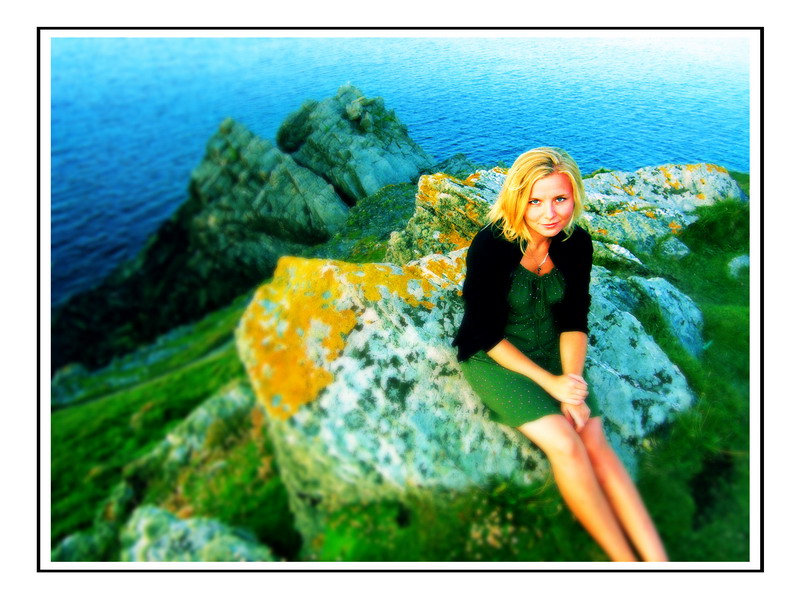
Newquay
| Photographer: | Pawel Favre |
|---|---|
| Folder: | Nore |
| Uploaded: | 21-May-2006 12:56 CEST |
| Current Rating: | 8.50/4 View all ratings Delete my rating |
| Model release available: | |
| Camera: | Olympus C5060 |
| Exposure time: | 1/80 |
| Aperture: | f/3.2 |
| Focal length: | |
| Lens: | |
| Focusing method: | |
| ISO: | 100 |
| White balance: | |
| Flash: | no |
| Image format: | SHQ |
| Processing applied: | Basic image adjustments and then I used cross-process efect in Photoshop CS2 |
| Various: | |
| Image resized to: | 600x800 |

NO SUBJECT
I like it very much.
Good complementary green and yellow colours, peacefull and bright.
Regards, Manuel Sousa
manuel sousa at 23:23 CEST on 21-May-2006 [Reply]
Great color
I love the colors and composition. The yellow and green on the rocks works very well with the model's hair and dress. Was that planned or coincidence? Either way, it works great.
I think her legs and the rock beneath her shouldn't be unfocused though.
Darrell E at 04:40 CEST on 22-May-2006 [Reply]
thx
manuel sousa wrote:
> I like it very much.
> Good complementary green and yellow colours, peacefull and bright.
> Regards, Manuel Sousa
>
thx manuel. nice to hear it. You took some really nice photos as well!!
Pawel Favre at 08:00 CEST on 22-May-2006 [Reply]
NO SUBJECT
Darrell E wrote:
> I love the colors and composition. The yellow and green on the rocks works very well with
> the model's hair and dress. Was that planned or coincidence? Either way, it works great.
>
> I think her legs and the rock beneath her shouldn't be unfocused though.
>
It was just a coincidence Darrell. I worked on this photo in rush and I reckon you're right. I should leave some parts of this photo focused. Thx for comment!
Pawel Favre at 08:02 CEST on 22-May-2006 [Reply]
NO SUBJECT
Hello Pawel !. Another great portrait. Your girl is very expressive, good model. For me is a good example of composition, in spite of the brilliant colours, you going directly to the eyes of the girl; maybe because her legs and the right corner is a little blurry. Best regards,
Ricardo
Ricardo Rico at 19:31 CEST on 22-May-2006 [Reply]
thx Ricardo
Ricardo Rico wrote:
> Hello Pawel !. Another great portrait. Your girl is very expressive, good model. For me is
> a good example of composition, in spite of the brilliant colours, you going directly to the
> eyes of the girl; maybe because her legs and the right corner is a little blurry. Best regards,
> Ricardo
>
thx Ricardo. I love to experiment with colours in Photoshop and that's why I used cross-process efect. I also blurred whole picture because it was too sharp. After I buy better camera I won't have to do that cause it'll be quite easy to achieve better depth of field. thx again!!
Pawel Favre at 21:49 CEST on 22-May-2006 [Reply]
NO SUBJECT
very very nice! beautiful girlfriend aint she Pawel?
did you use actions here again?
Marco Lazzeri at 13:46 CEST on 24-May-2006 [Reply]
thx Marco
Marco Lazzeri wrote:
> very very nice! beautiful girlfriend aint she Pawel?
> did you use actions here again?
>
thx Marco!! this time I used cross-process efect. I can send You more details how to make photos looks like this one if u want... BTW - Yes - She's beautiful:) thx again
Pawel Favre at 09:47 CEST on 25-May-2006 [Reply]
NO SUBJECT
Pawel Favre wrote:
> Marco Lazzeri wrote:
> > very very nice! beautiful girlfriend aint she Pawel?
> > did you use actions here again?
> >
>
>
> thx Marco!! this time I used cross-process efect. I can send You more details how to make
> photos looks like this one if u want... BTW - Yes - She's beautiful:) thx again
>
Yes Pawel pls send me. the one that you sent me last time really did a good job in bringing warmth
and nice effects on some old and stock pictures of mine. thanks again. I'll be waiting for it.
Marco Lazzeri at 13:40 CEST on 25-May-2006 [Reply]