The Photographic Community for Users of Olympus and OM system micro 4/3 digital cameras and E-series DSLRs
| Home | Login |
Search
Forum
Actions
New Document
New Folder
List Folders
List Documents
List Groups
List Users
Camera resources
Olympus 4000
Olympus 4040
Olympus 5050
Olympus 5060
Olympus 7070
Olympus 8080
Olympus E-M1 II
Olympus E-M5
Olympus E-P1
Olympus E-P2
Olympus E-PL1
Olympus E-PL3
Olympus E1
Olympus E3
Olympus E30
Olympus E300
Olympus E330
Olympus E400
Olympus E410
Olympus E420
Olympus E500
Olympus E510
Olympus E520
Olympus E620
m4/3 lenses
Camera FAQs
Terms of Service
Photo contest
Submissions page
Hall of fame
Folders
About this site
Documents
Polls
Private folders
Public folders
Categories
Abstract
Action/Motion
Animal
Architecture
Candid/Snapshot
Cities/Urban
Documentation
Fashion/Glamour
Historical
Landscape
Macro
Miscellaneous
Nature
Night/Low light
People
Polls
Sand and Sea
Sky
Tourist/Travel
Contact Us
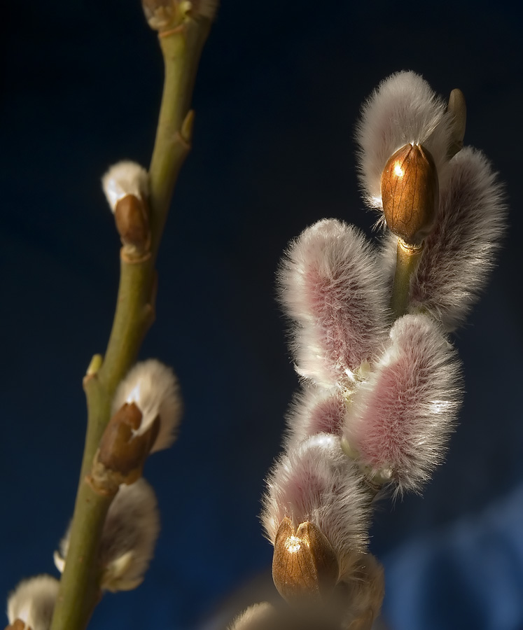
Branch in full bud 3

Copyright ©2006, Sergey Green
Viewed times
The first attempts had some overblown highlights, so I tried once again. - Sergey
| Photographer: | Sergey Green |
|---|---|
| Folder: | sngreen |
| Uploaded: | 25-Feb-2006 23:04 CET |
| Current Rating: | 9.00/2 View all ratings Delete my rating |
| Model release available: | |
| Camera: | Olympus E500 |
| Exposure time: | 1/13 s |
| Aperture: | F/10 |
| Focal length: | 54 mm |
| Lens: | 14-54 |
| Focusing method: | |
| ISO: | 100 |
| White balance: | Auto |
| Flash: | no |
| Image format: | RAW |
| Processing applied: | |
| Various: | |
| Image resized to: | 900x747 |
NO SUBJECT
I prefer that one Sergey,in any way:like a composition,like a collors,brightenes,sharpenes...One complain:why so big image?
karmen orlić gr?etić at 01:05 CET on 26-Feb-2006 [Reply]
Branch in full bud 3
karmen orlić gr?etić wrote:
> I prefer that one Sergey,in any way:like a composition,like a collors,brightenes,sharpenes...One
> complain:why so big image?
>
Thank you Karmen,
The size was my mistake. I corrected it.
-
Sergey Green at 06:46 CET on 26-Feb-2006 [Reply]
NO SUBJECT
Very nice Sergey, way better than the first one.
Lightning is perfect.
A little remark though:
Cloning out the OOF twig in the background would improve/upgrade this picture to a Winner .
This because it distract's a little from the main subject that is exposed great.But that is my idea, maybe I am totally wrong and to picky.....;-)
regards,
Fonzy - at 13:42 CET on 26-Feb-2006 [Reply]
Branch in full bud 3
Fons van Swaal wrote:
> Very nice Sergey, way better than the first one.
> Lightning is perfect.
> A little remark though:
> Cloning out the OOF twig in the background would improve/upgrade this picture to a Winner .
> This because it distract's a little from the main subject that is exposed great.But that is
> my idea, maybe I am totally wrong and to picky.....;-)
>
> regards,
>
You can try it yourself, if you want to, to see what it would look like. I personally think it looks more natural with other branches in the background. Use patch tool and healing brush (if necessary) to remove the branch or blur the background and then mask out the good stuff. Either way it is an easy exercise.
-
Sergey Green at 15:14 CET on 26-Feb-2006 [Reply]
NO SUBJECT
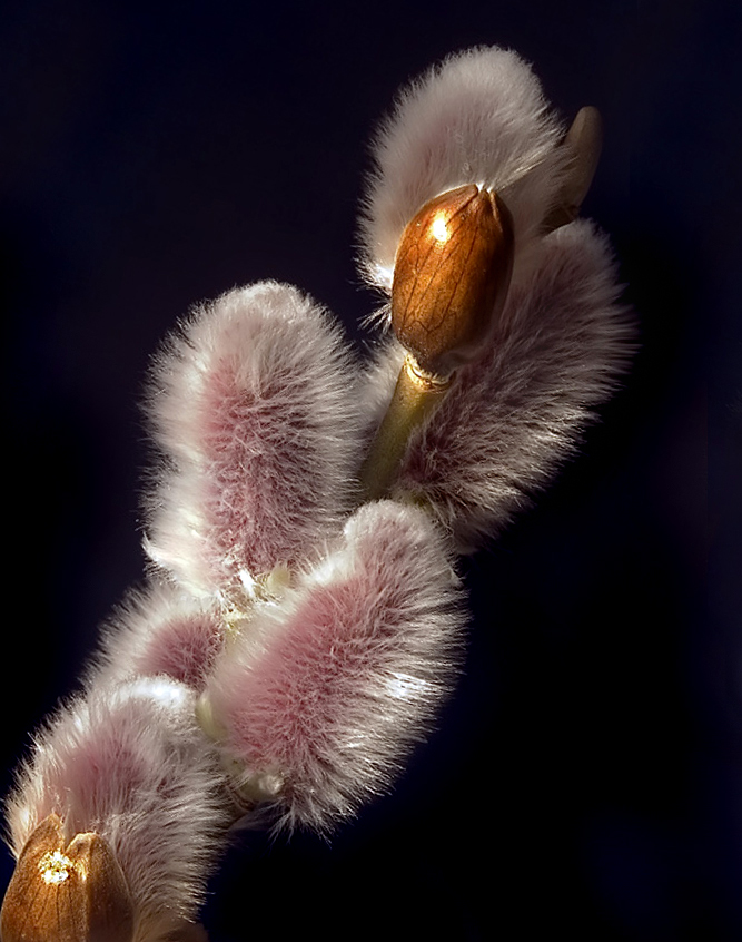
You said try your self , here it is .

Tell me when you have seen it and I will remove the picture...
regards,
Fonzy - at 15:41 CET on 26-Feb-2006 [Reply]
NO SUBJECT
Very nice macro picture Sergey, very sharpen, nice colors. Congratulations. The cropped version posted by Fons also looks fantastics. Best regards,
Ricardo
Ricardo Rico at 17:09 CET on 26-Feb-2006 [Reply]
Branch in full bud 3
Fons van Swaal wrote:
> You said try your self , here it is .
>
> Tell me when you have seen it and I will remove the picture...
>
> regards,
>
>
>
I see what you mean. I am confused now as which looks better. I thought it looked better with other branch, but you also slightly zoomed and tilted it, so it better fills the frame. Well, I do not know now.
Could you leave it there?
-
Sergey Green at 17:39 CET on 26-Feb-2006 [Reply]
NO SUBJECT
Sergey Green wrote:
> I see what you mean. I am confused now as which looks better. I thought it looked better with
> other branch, but you also slightly zoomed and tilted it, so it better fills the frame. Well,
> I do not know now.
>
> Could you leave it there?
>
> -
Hi sergey,
You are right , I tilted it and due of the crop it magnified a little .
I think your picture is a more natural one.
You can see in my pictures that there was some post processing
I like it though , I like the two pictures I must say...
I leave it there as long as you want , just tell me when to take it away...
regards,
Fonzy - at 17:52 CET on 26-Feb-2006 [Reply]