The Photographic Community for Users of Olympus and OM system micro 4/3 digital cameras and E-series DSLRs
| Home | Login |
Search
Forum
Actions
New Document
New Folder
List Folders
List Documents
List Groups
List Users
Camera resources
Olympus 4000
Olympus 4040
Olympus 5050
Olympus 5060
Olympus 7070
Olympus 8080
Olympus E-M1 II
Olympus E-M5
Olympus E-P1
Olympus E-P2
Olympus E-PL1
Olympus E-PL3
Olympus E1
Olympus E3
Olympus E30
Olympus E300
Olympus E330
Olympus E400
Olympus E410
Olympus E420
Olympus E500
Olympus E510
Olympus E520
Olympus E620
m4/3 lenses
Camera FAQs
Terms of Service
Photo contest
Submissions page
Hall of fame
Folders
About this site
Documents
Polls
Private folders
Public folders
Categories
Abstract
Action/Motion
Animal
Architecture
Candid/Snapshot
Cities/Urban
Documentation
Fashion/Glamour
Historical
Landscape
Macro
Miscellaneous
Nature
Night/Low light
People
Polls
Sand and Sea
Sky
Tourist/Travel
Contact Us
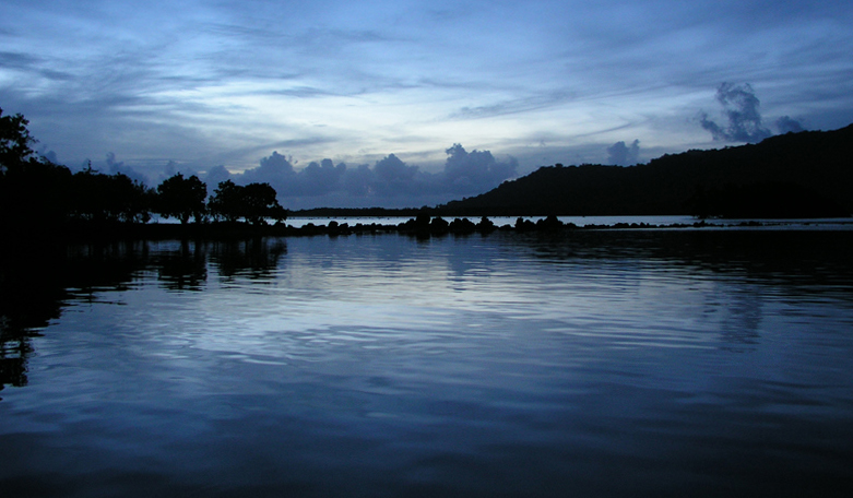
Utwe Harbor at Dusk

Copyright ©2012, Katrina Adams
Viewed times
Dusk was rapidly turning to night when I took this photo.
| Photographer: | Katrina Adams |
|---|---|
| Folder: | Katrina's Kosrae Images |
| Uploaded: | 10-Feb-2012 06:27 CET |
| Current Rating: | 8.33/3 View all ratings Delete my rating |
| Model release available: | |
| Camera: | Olympus C5050Z |
| Exposure time: | 1/15 s |
| Aperture: | F1.8 |
| Focal length: | 7.1 mm |
| Lens: | |
| Focusing method: | |
| ISO: | 125 |
| White balance: | |
| Flash: | no |
| Image format: | HQ |
| Processing applied: | |
| Various: | |
| Image resized to: | 456x781 |
NO SUBJECT
Cool! I like the tones and the atmosphere but I do feel it needs straightening a little (important with lake and sea compositions). I also think you should play around with cropping into a more panoramic format. It's good, it could be great! Regards, Mike
Mike Bywater at 18:24 CET on 11-Feb-2012 [Reply]
Color
Katrina,
The shades of blue are fantastic!
Mark Stodter
Mark Stodter at 16:29 CET on 12-Feb-2012 [Reply]
NO SUBJECT
Mike Bywater wrote:
> Cool! I like the tones and the atmosphere but I do feel it needs straightening a little (important
> with lake and sea compositions). I also think you should play around with cropping into a
> more panoramic format. It's good, it could be great! Regards, Mike
>
Thanks Mike!
I'll try your suggestions and post the result.
Katrina
Katrina Adams at 06:34 CET on 13-Feb-2012 [Reply]
NO SUBJECT
Mark Stodter wrote:
> Katrina,
> The shades of blue are fantastic!
> Mark Stodter
>
Thanks Mark!
We get some pretty amazing lighting effects here.
Cheers,
Katrina
Katrina Adams at 06:35 CET on 13-Feb-2012 [Reply]
NO SUBJECT
Mike Bywater wrote:
> Cool! I like the tones and the atmosphere but I do feel it needs straightening a little (important
> with lake and sea compositions). I also think you should play around with cropping into a
> more panoramic format. It's good, it could be great! Regards, Mike
>
Hi Mike,
I did a little straightening, and cropping (more from the sky than the water).
Katrina
Katrina Adams at 00:28 CET on 14-Feb-2012 [Reply]
NO SUBJECT
small tweaks can have a dramatic effect! Yes, the water is more important than the sky here. The proportions are wonderful. As I get older I find myself less willing to accept the format of a picture straight from the camera - I look for the format that best displays the picture - be bold!
regards, Mike
Mike Bywater at 01:54 CET on 14-Feb-2012 [Reply]
NO SUBJECT
Mike Bywater wrote:
> small tweaks can have a dramatic effect! Yes, the water is more important than the sky here.
> The proportions are wonderful. As I get older I find myself less willing to accept the format
> of a picture straight from the camera - I look for the format that best displays the picture - be bold!
> regards, Mike
>
Thanks for the great advice!
Katrina Adams at 05:49 CET on 15-Feb-2012 [Reply]
would put it on my wall
Could see this on a wall, blown up to poster plus size. The clouds in the background look like trees or even mountains giving the image a lot more depth and interest, with out them not so much. I like this image a lot you should print some up and try selling them on ebay or to posters.com or something. Keep up the good work.
Adam Crowe at 05:13 CET on 12-Mar-2012 [Reply]
NO SUBJECT
Thanks Adam!
Katrina Adams at 06:25 CET on 12-Mar-2012 [Reply]