The Photographic Community for Users of Olympus and OM system micro 4/3 digital cameras and E-series DSLRs
| Home | Login |
Search
Forum
Actions
New Document
New Folder
List Folders
List Documents
List Groups
List Users
Camera resources
Olympus 4000
Olympus 4040
Olympus 5050
Olympus 5060
Olympus 7070
Olympus 8080
Olympus E-M1 II
Olympus E-M5
Olympus E-P1
Olympus E-P2
Olympus E-PL1
Olympus E-PL3
Olympus E1
Olympus E3
Olympus E30
Olympus E300
Olympus E330
Olympus E400
Olympus E410
Olympus E420
Olympus E500
Olympus E510
Olympus E520
Olympus E620
m4/3 lenses
Camera FAQs
Terms of Service
Photo contest
Submissions page
Hall of fame
Folders
About this site
Documents
Polls
Private folders
Public folders
Categories
Abstract
Action/Motion
Animal
Architecture
Candid/Snapshot
Cities/Urban
Documentation
Fashion/Glamour
Historical
Landscape
Macro
Miscellaneous
Nature
Night/Low light
People
Polls
Sand and Sea
Sky
Tourist/Travel
Contact Us
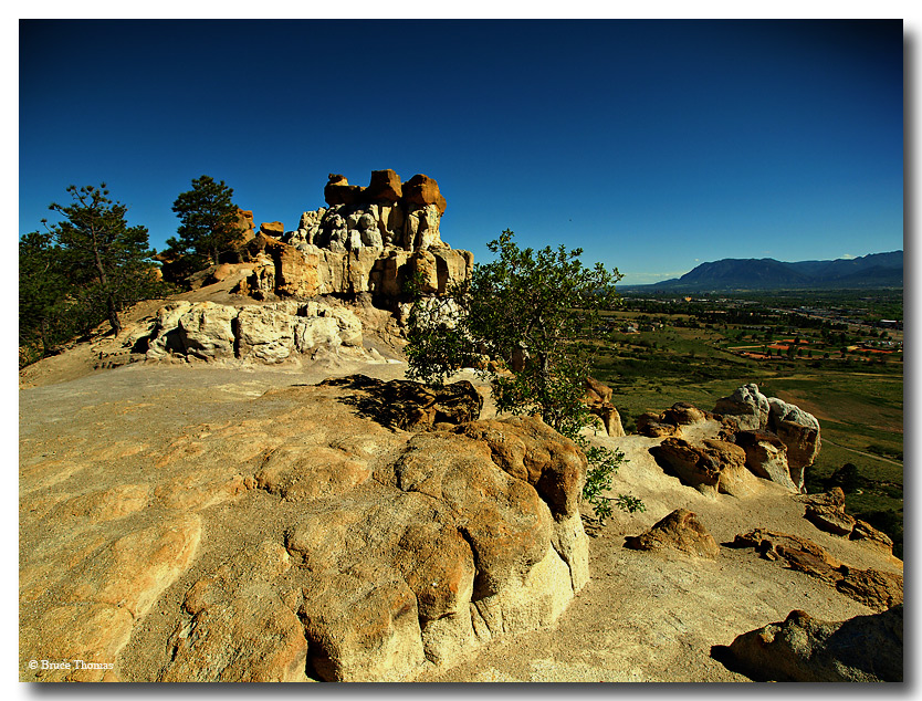
Up On Pulpit Rock (Single Exposure Version)

Copyright ©2010, Bruce Thomas
Viewed times
Here is the Single Exposure version of "Up On Pulpit Rock"...
Alfred started an interesting thread asking if the 5 exposure HDR really "added" anything to this shot.....so let's all compare and see.
Compare to the 5 shot HRR version:
http://myolympus.org/document.php?id=16671Thanks....
| Photographer: | Bruce Thomas |
|---|---|
| Folder: | Bruce Thomas |
| Uploaded: | 01-Jun-2010 01:59 CEST |
| Current Rating: | 7.50/2 View all ratings Delete my rating |
| Model release available: | |
| Camera: | Olympus E30 |
| Exposure time: | |
| Aperture: | 7.1 |
| Focal length: | 9mm |
| Lens: | 9-18mm |
| Focusing method: | iESP |
| ISO: | 100 |
| White balance: | |
| Flash: | no |
| Image format: | HQ |
| Processing applied: | |
| Various: | |
| Image resized to: | 634x834 |
NO SUBJECT
I still think the 5 exposure HDR looks 'best'.
Lot's of mid range contrasts that are supplied by the 5 exposures that are present, but weaker in the single exposure.
The 5 exposure HDR looks more '3D' to me, like you could walk right "in" to the scene.
The 5 exposure HDR looks more like a film rendering to me.
.
Bruce Thomas at 02:14 CEST on 01-Jun-2010 [Reply]
NO SUBJECT
This one has a better composition (more foreground), but the other one was more 'punchy'. So this is as far as you get with just one RAW?
By the way, why do you need five exposures - wouldn't two or three be enough?
I have to give a try to HDR one of these days.
Alfred Molon at 19:57 CEST on 01-Jun-2010 [Reply]
I prefer this to the HDR one
A beautiful shot again, Bruce. Personally, I prefer the single shot, but see some advantages in the HDR. My wife carefully says "Basically, I think it's personal opinion of the viewer. The HDR one seems to reduce the contrast, but the non-HDR looks a little more natural." Which may be her way of saying that she doesn't agree with me!
Anyway, some observations: First impression with HDR "Why is the sky black?" Otherwise, more detail in the distant mountains and countryside, and the tree in the middle seems more attractive. But overall a little dark and low-contrast for my taste.
Non-HDR is more natural-looking, with good contrast, if a little less detail in some areas as a result. Not sure why the vignetting in the sky? I prefer the slightly different composition of the non-HDR shot too.
Of course, all is subjective, as with all photography!
Looks like a nice place to be.
Jim Padget at 08:29 CEST on 02-Jun-2010 [Reply]